Two apps for a single day
Habits on one side, to-dos on the other: you juggle two apps, then end up dropping one.
 DoxneHabit tracker and to-do · iPhone
Habits and to-dos, finally in one iPhone app. I designed and built it on my own, from UX research all the way to the App Store.
(01) The project
Doxne brings your habits and your to-do list together in one iPhone app. One tap to check off, a bar that fills up to 100%, and clear stats to see your progress day after day.
(02) The problem
Habit and to-do apps live apart, ask for an account and turn every slip into a red failure. Doxne was born from these three frictions.
Habits on one side, to-dos on the other: you juggle two apps, then end up dropping one.
Missed days in red, broken streaks: the app lectures you, and you stop opening it.
Sign-ups, servers, ads, tracking: many apps ask for too much. Doxne works without an account, and your data stays on your iPhone.
(03) The process
A process I ran on my own from start to finish. Every step is documented in my Figma file.
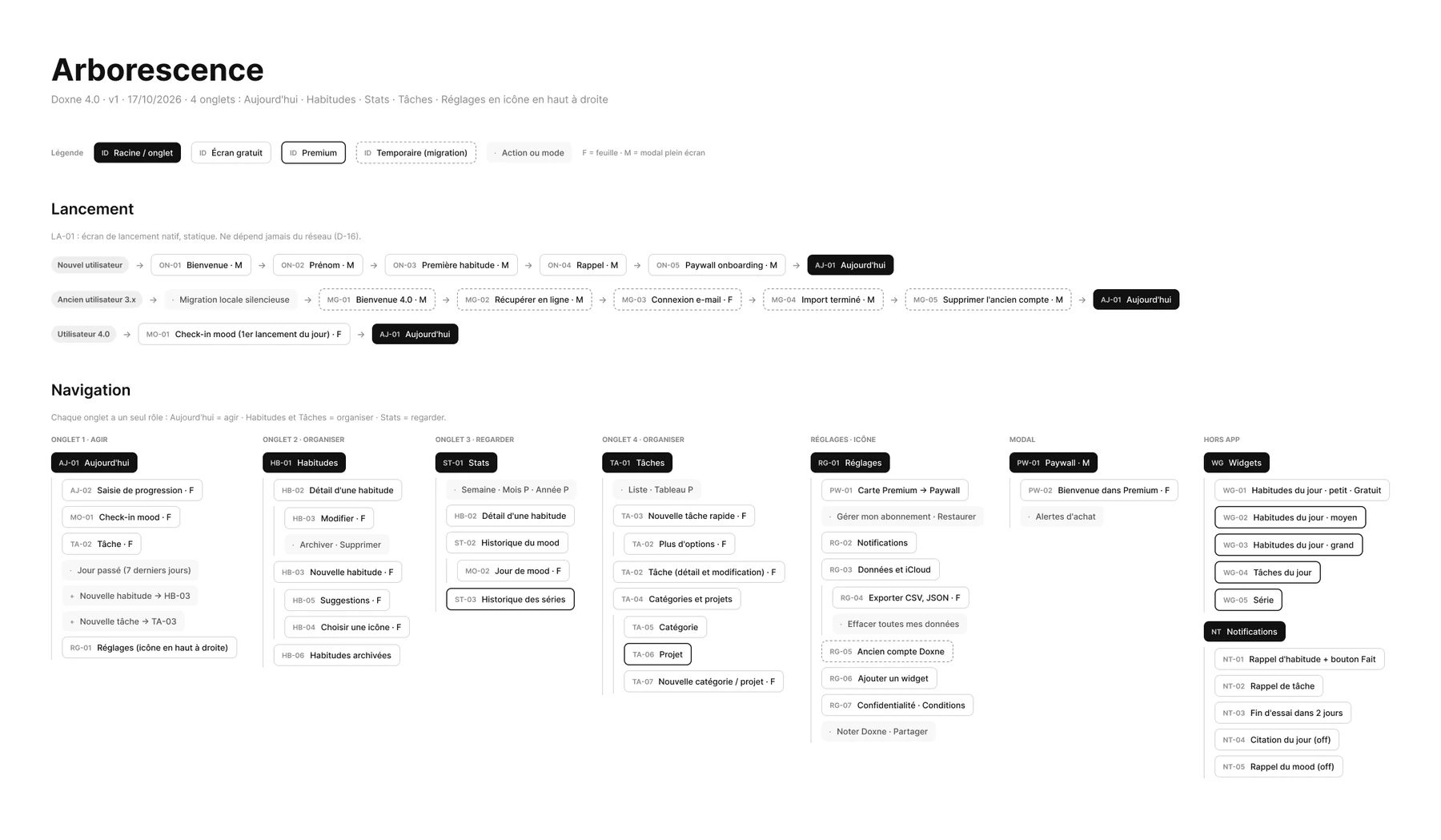
(04) The app in detail
Scroll down: the iPhone changes screen with each feature.
01 · Habits
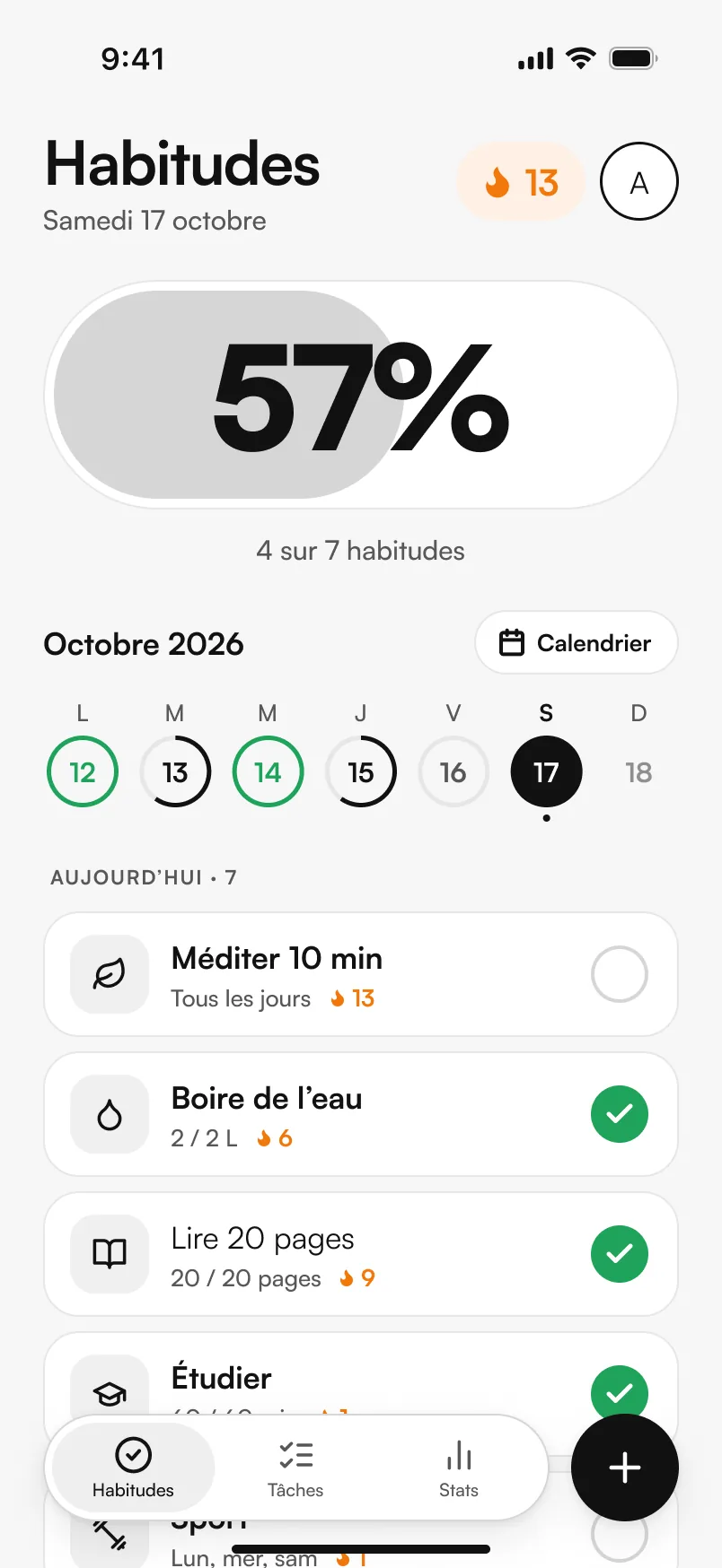
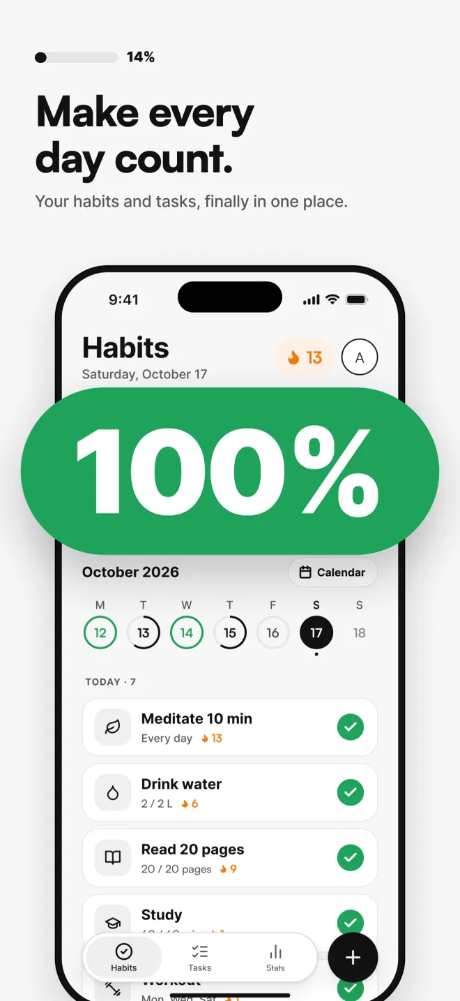
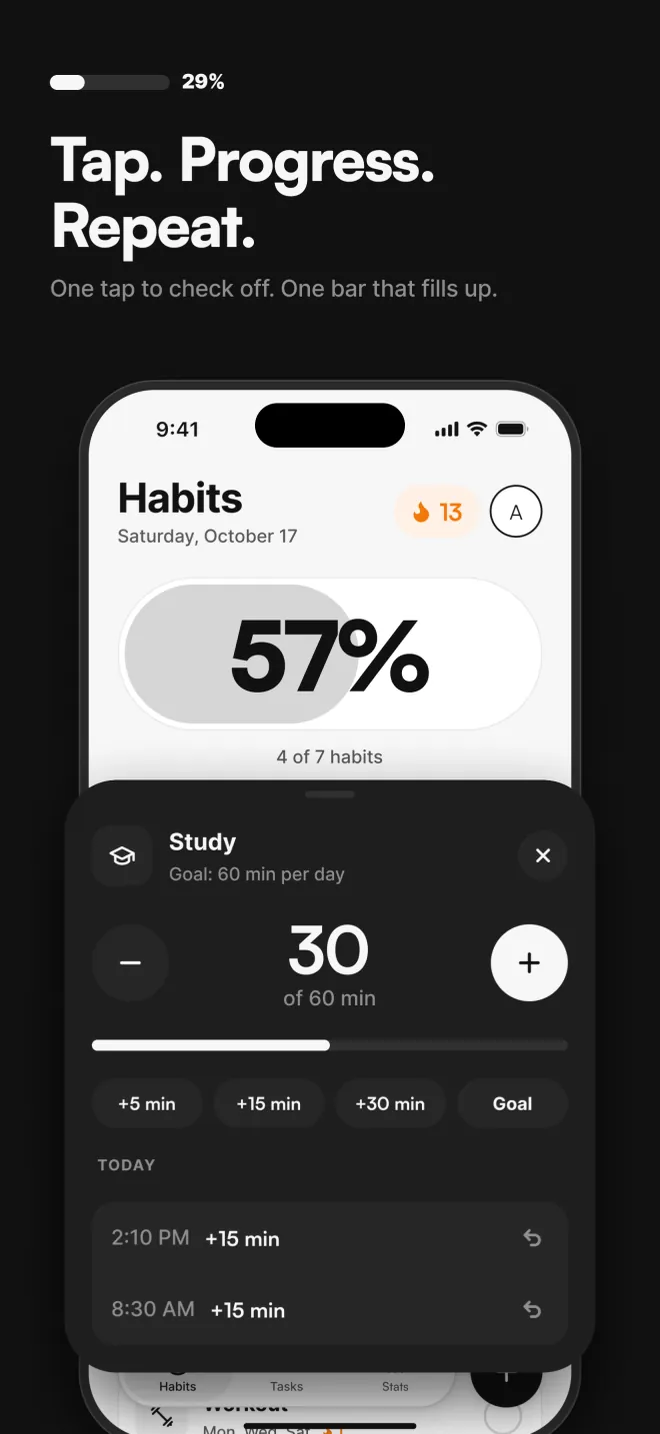
Each habit is checked off in one tap, simple or measurable (2 L of water, 60 min of study). The big daily bar climbs to 100%: seeing your day move forward makes you want to finish it.
02 · Dark mode
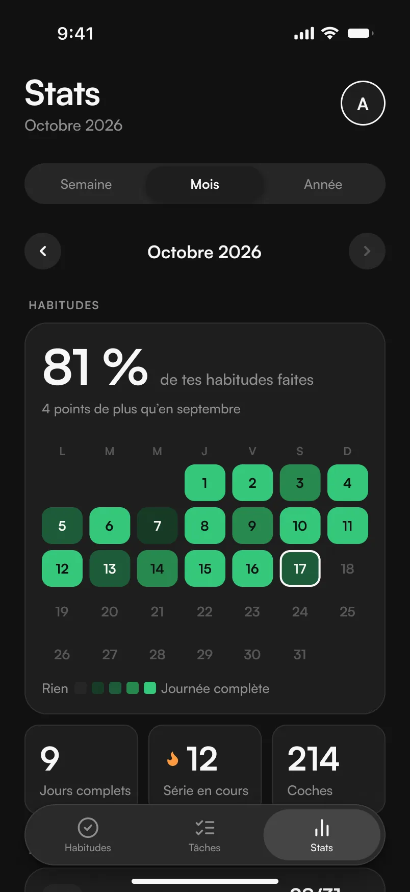
Every color exists in two versions in the design system. In dark mode, the green gets brighter to keep the same meaning and readability.

03 · Tasks
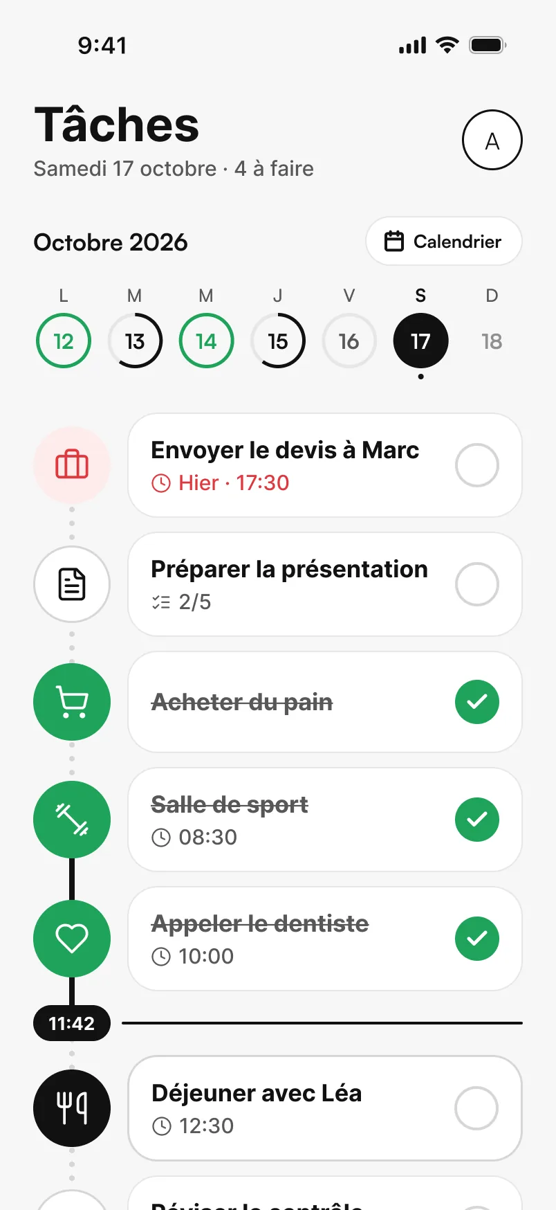
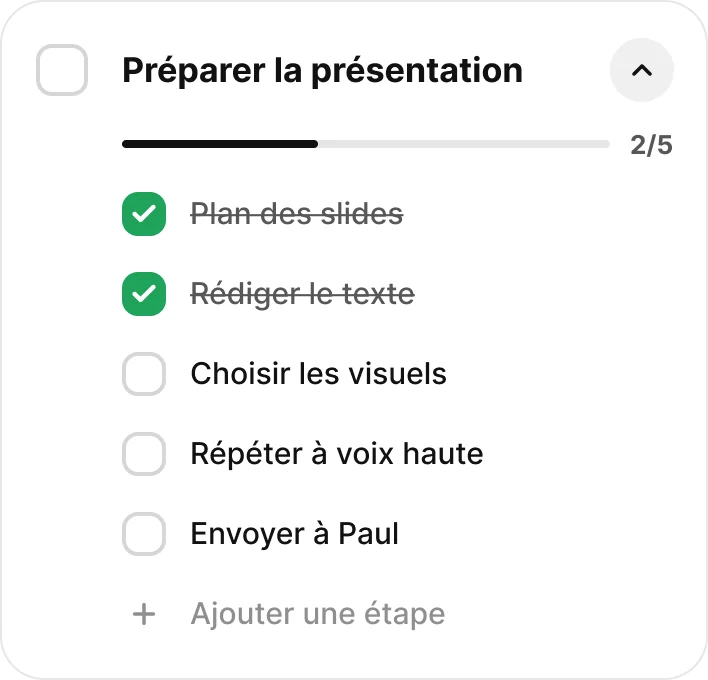
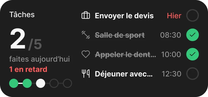
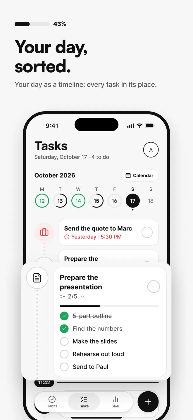
Tasks appear on a timeline of your day, each at its own time, with subtasks to check off, repeats and reminders. An overdue task is the only thing shown in red.
04 · Stats
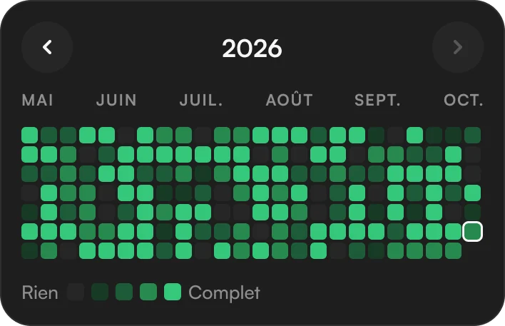
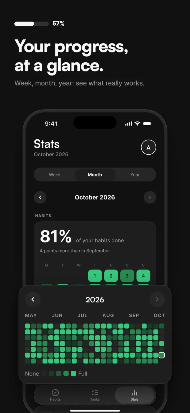
Week, month, year: a calendar that fills up with green and a few simple numbers. Everything is calculated on the iPhone, with no AI and no server.
05 · Streak
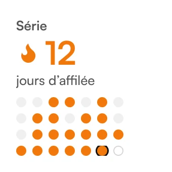
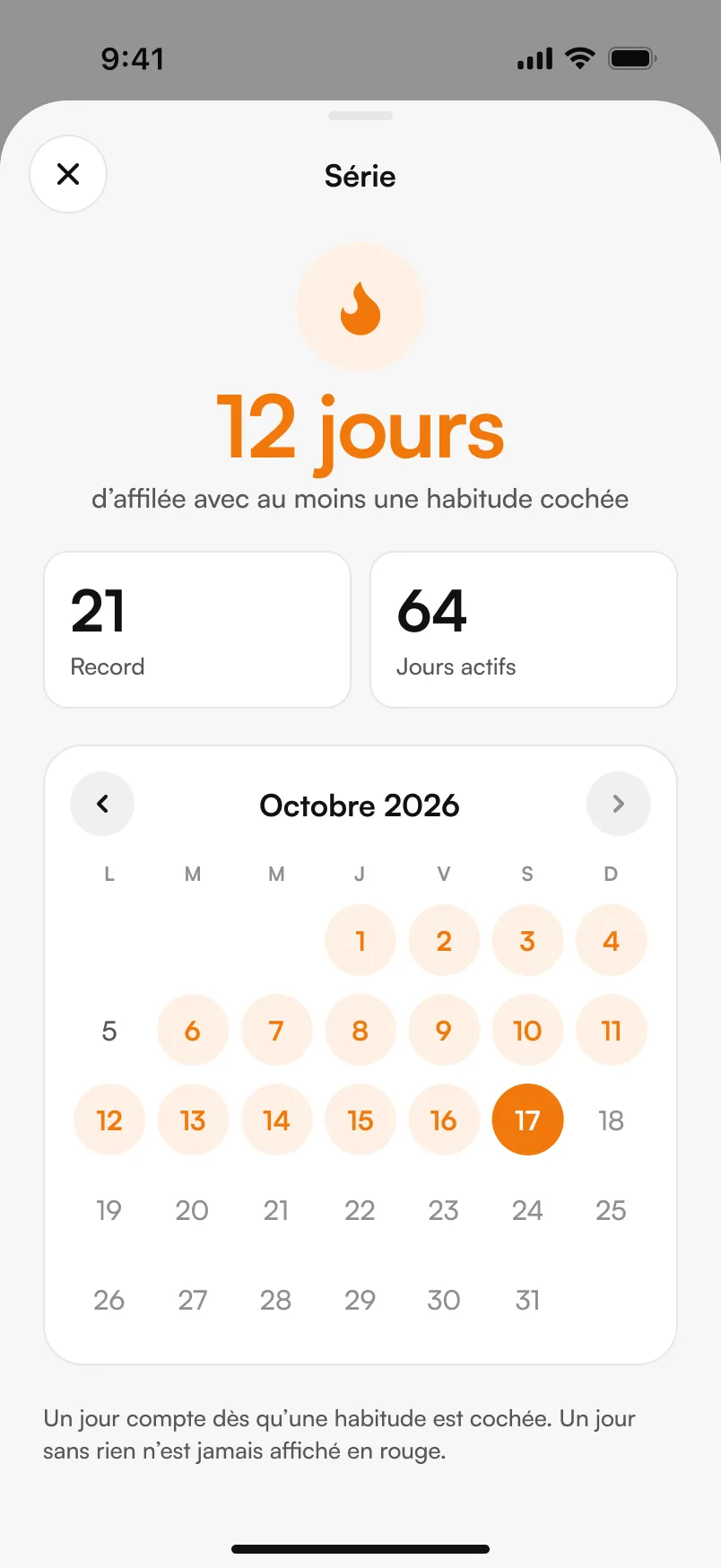
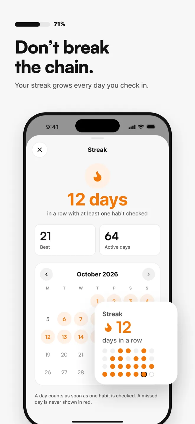
The streak grows every day at least one habit is checked. An empty day stays light gray, never red: the app motivates without lecturing.
06 · Widgets
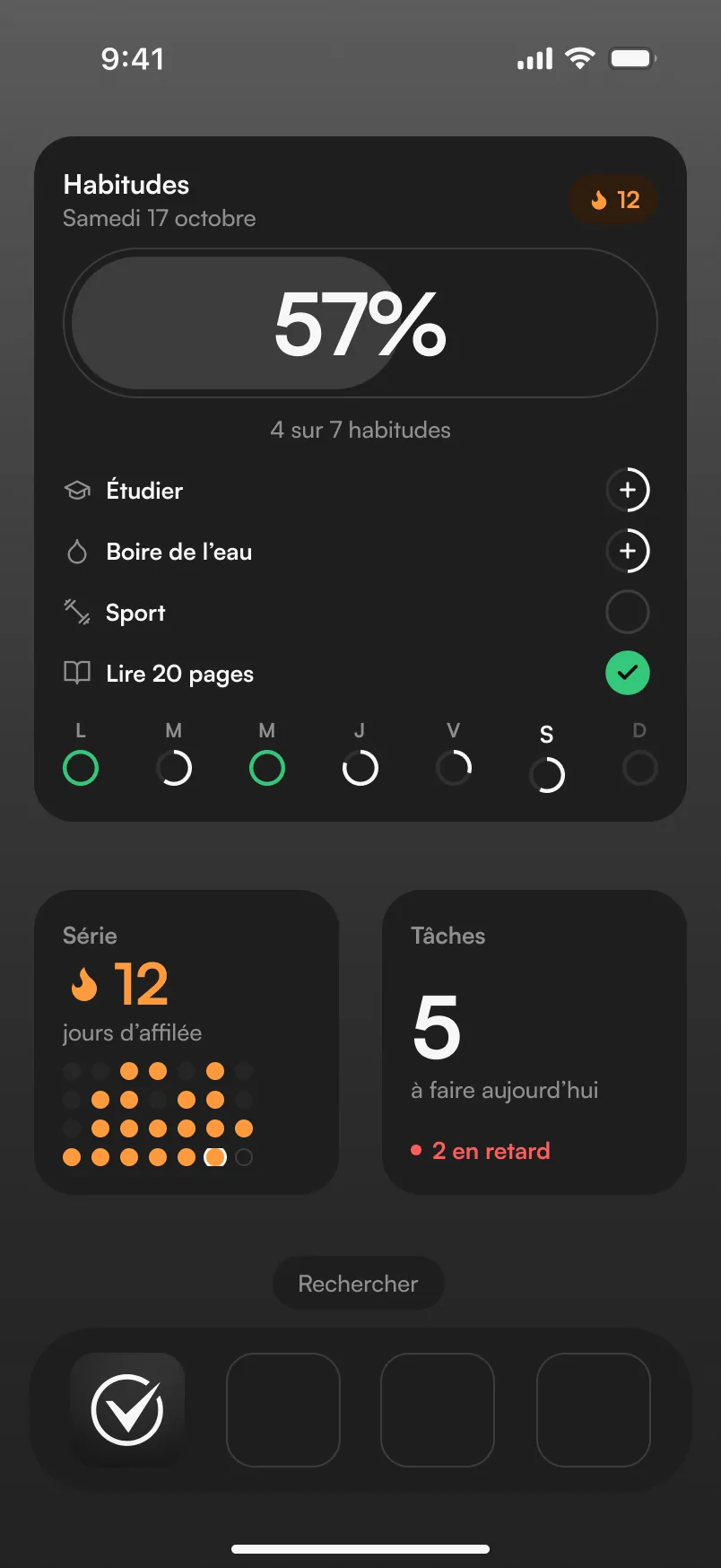
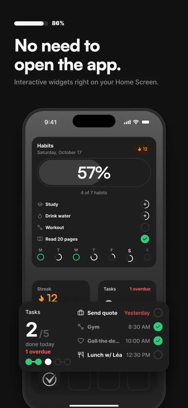
Interactive Home Screen widgets let you check off a habit or a task directly. The check is saved right away and shows up in the app.
07 · Privacy
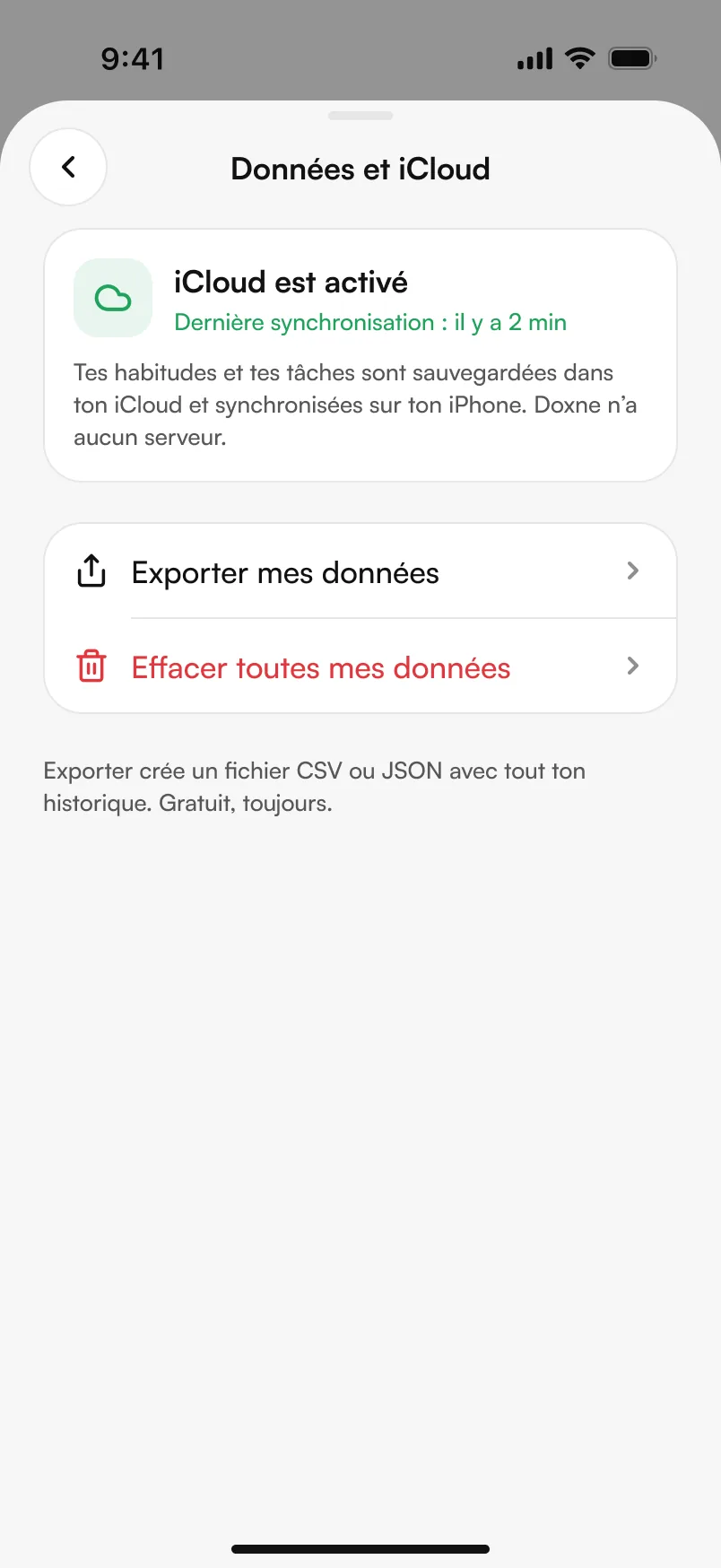
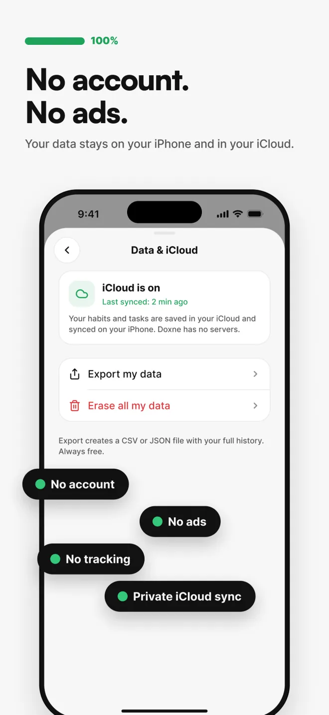
No sign-up, no ads, no tracking, no Doxne server. Data stays on the iPhone and in each user's private iCloud, exportable as CSV or JSON.
(05) Design system
Neutral black, white and gray. Color carries meaning, never decoration. Every token exists in light mode and in dark mode.
(06) On the App Store
I also create the App Store listing visuals, in the same Figma file as the app.
(07) What I take away
Doxne is my most complete project: research, UX, UI, code, release and marketing, from A to Z.
An idea, a question about my apps, or just want to talk design? Let's talk.
Get in touch